
The Opulent World of Alma-Tadema
Unpacking Roses of Heliogabalus (1888)

In the realm of Victorian art, few names shine as brightly as Lawrence Alma-Tadema. This Dutch-British painter's works are a masterclass in elegance and historical nuance.
Today, we'll dive into one of his most breathtaking pieces: Roses of Heliogabalus (1888).
A Glimpse into Ancient Rome
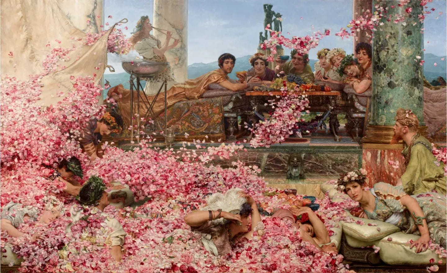
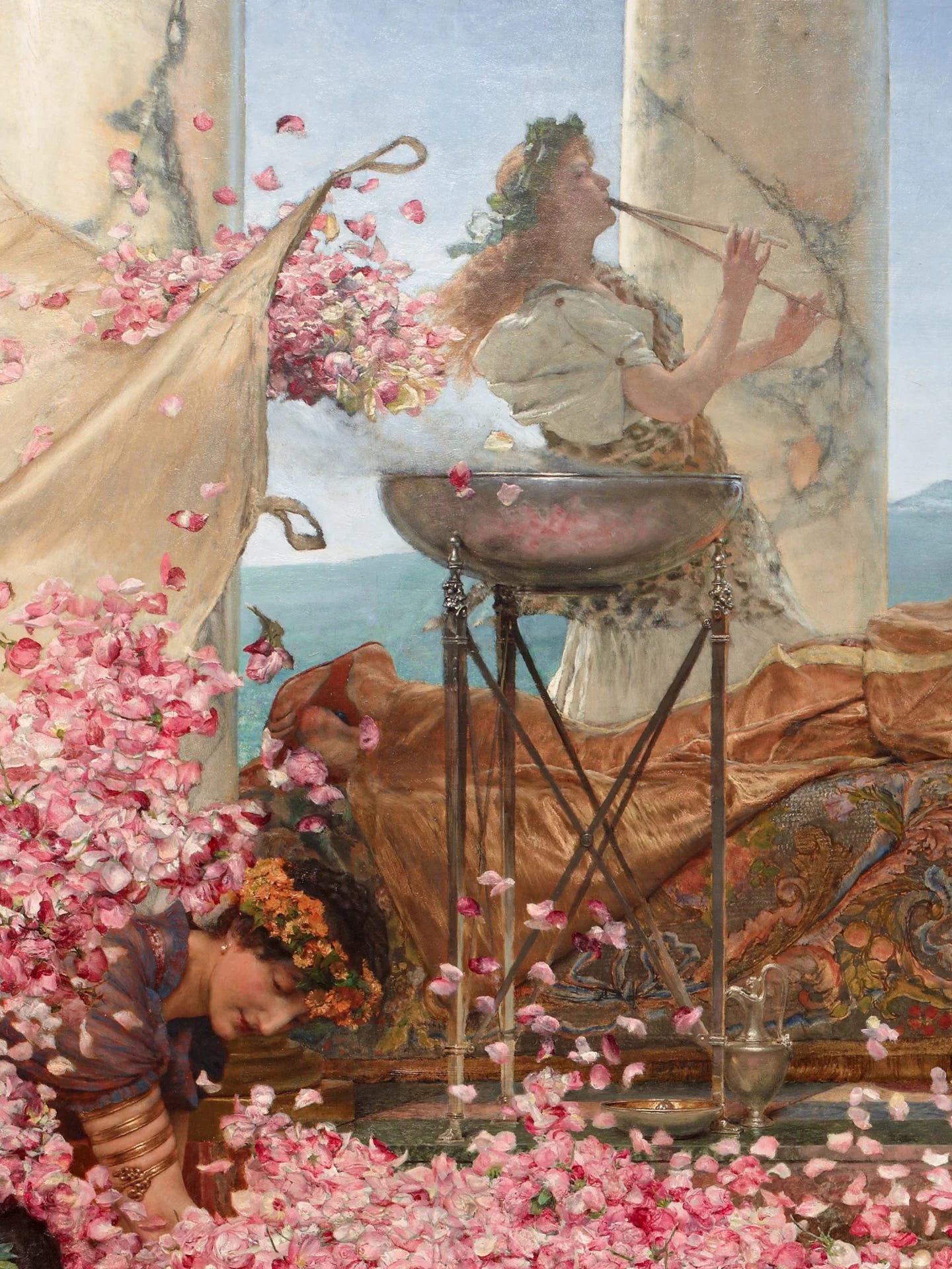
Roses of Heliogabalus transports us to the decadent world of ancient Rome, specifically to the reign of Emperor Heliogabalus (218-222 AD).
The painting depicts a scene of unbridled luxury, where guests lie on couches, smothered by a deluge of rose petals.


The air is thick with the scent of blooming flowers, and the atmosphere is heavy with excess.


A Masterful Composition
Alma-Tadema's composition is a marvel of balance and harmony. The painting's focal point is the emperor himself, lounging on a raised dais, surrounded by his courtiers and guests. The rose petals, rendered in soft, delicate brushstrokes, cascade down from above, creating a sense of movement and energy. The artist's use of light and shadow adds depth and dimensionality to the scene, drawing the viewer's eye through the intricate details.


Historical Context and Symbolism
Heliogabalus was infamous for his extravagance and tyranny. By depicting this scene of rose-induced asphyxiation, Alma-Tadema subtly critiques the excesses of the Roman Empire.


The roses, often associated with love and beauty, become a symbol of the emperor's decadence and the corrupting influence of power.
Alma-Tadema's Artistic Innovations
Roses of Heliogabalus showcases Alma-Tadema's innovative approach to historical painting.
He rejected the traditional grand narrative style, instead focusing on intimate, domestic scenes that revealed the intricacies of ancient life.
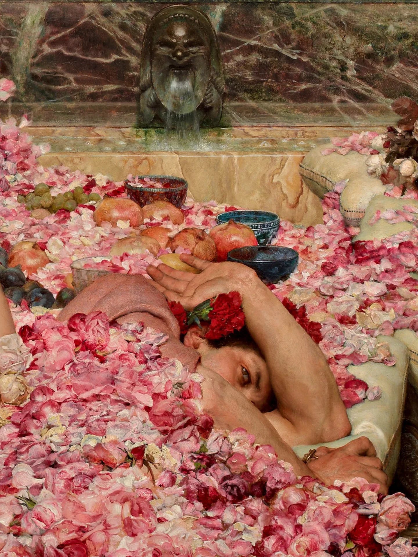
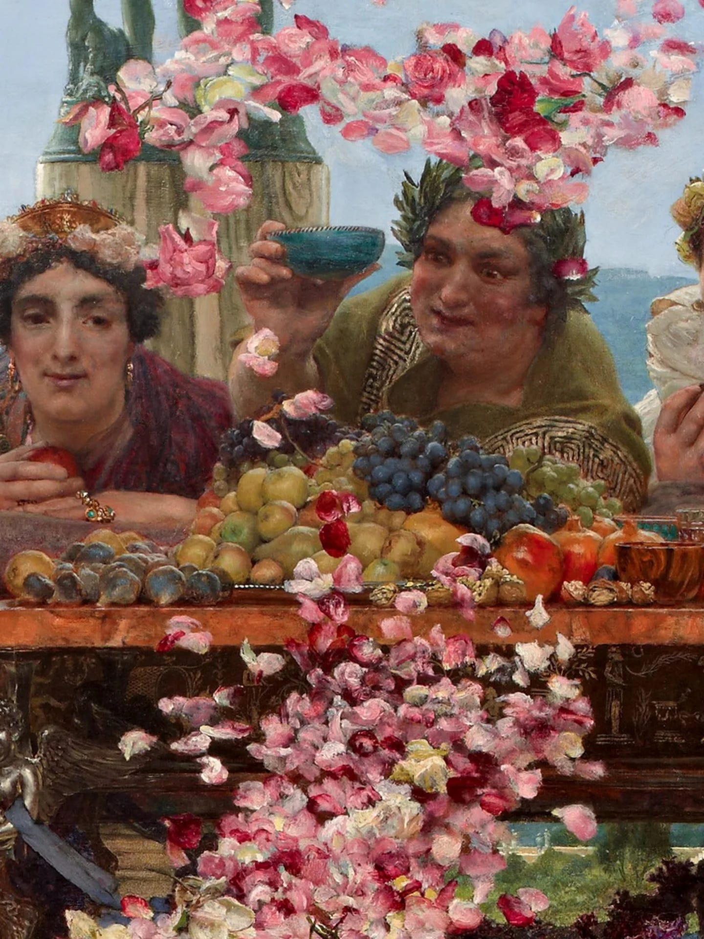
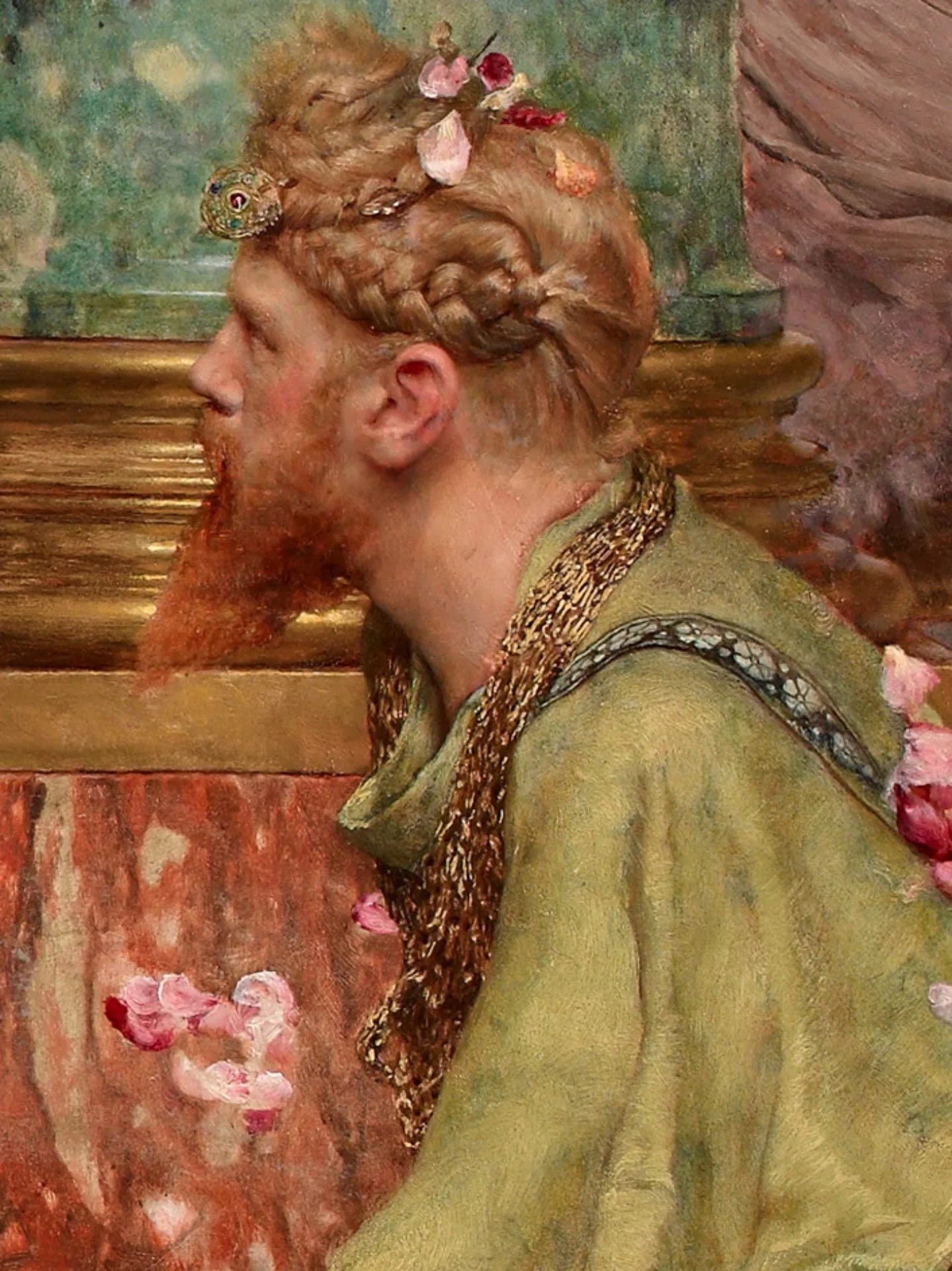
His meticulous attention to detail and commitment to archaeological accuracy earned him widespread acclaim.
Roses of Heliogabalus is a masterpiece that embodies the essence of Alma-Tadema's artistry. With its sumptuous colors, intricate details, and thought-provoking themes, this painting invites us to step into the opulent world of ancient Rome.
As we gaze upon the rose-covered figures, we're reminded of the transience of power and the enduring allure of beauty.
Thank you for being part of Cultural Canvas! If you love what we do, consider supporting us to keep it free for everyone. Stay inspired and see you in the next post!
While there is some very beautiful painting in this piece, on the whole, I completely disagree with your analysis. The picture is way, way overweighed with rosy-white coloration in general, and especially on the lower left that heavily imbalances the composition because of the amount of people placed in the upper right diagonal half. It looks like a silly mess to me.